


I came across Froggy a couple of weeks back, so essentially Froggy helps you master CSS Flexbox by playing a game, sounds cool right? as of the time of writing this article, the Froggy game has 24 levels.
What is CSS Flexbox
CSS Flexbox provides a way of properly sectioning content on your website so that it's easy to style them and make them responsive. As a Frontend Developer, it is important to know how the Flexbox model works and how to move contents inside the model.
I will be going through a few levels in the Froggy game and also explain as I go through them. After which you can go play the rest of the game yourself, do will to drop your feedback here, when you're done. I will also be dropping resources at the end of this article to help you understand CSS Flexbox better. But in the main time, let's dive right in...
justify-content
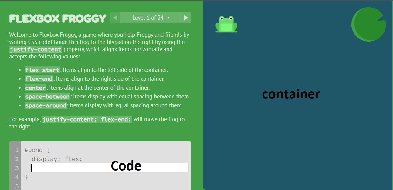 Let me quickly explain what's happening here, the container is our model, our job is to move the frog(s) from its current position and place it/them inside the lilypads. the side labelled code is where we will be writing our code, finally, at the top, we are giving useful tips to help us understand what we need to do.
Note: for every flexbox container, the first thing to do is to put a display: flex; on the container, without this, the flexbox properties will not apply. also one of the major advantages of using flexbox and its properties is that, as the browser resizes, the content resizes with it, so there is no overlapping content, all contents will remain in its rightful position expect its altered.
The first four levels focus on helping us master justify-content. justify-content is a property of the Flexbox layout, its function is to help us move content within a flexbox container in a horizontal direction (x-axis), so if you need to move content from left to right or right to left, justify-content is your guy, the justify-content property accepts five values
flex-start: // Items align to the top of the container.
flex-end: // Items align to the bottom of the container.
center: // Items align at the vertical center of the container.
baseline: // Items display at the baseline of the container.
stretch: // Items are stretched to fit the container.
align-items
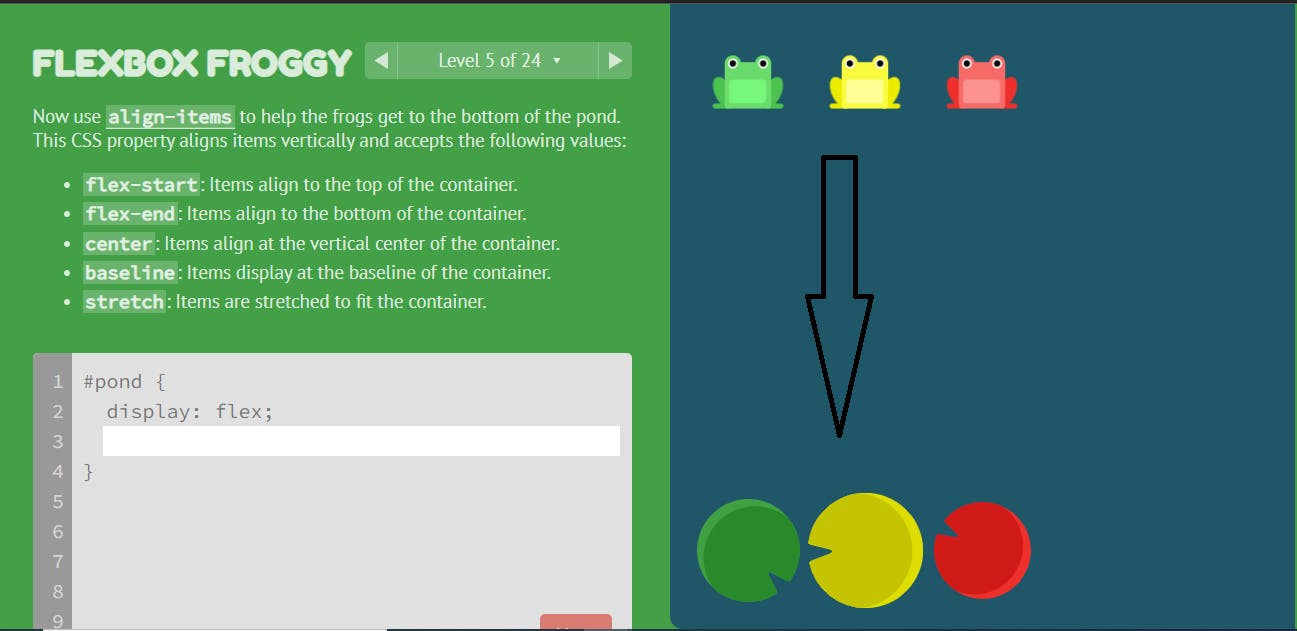 level 5 introduces
 align-items, which is also a flexbox property that helps us move content within our flexbox container in a vertical direction(y-axis), so if you need to move content from the top to the bottom or vice versa of its present container, align-items will get the job done, align-items accept five values which are:
flex-start: // Items align to the top of the container.
flex-end: // Items align to the bottom of the container.
center: // Items align at the vertical center of the container.
baseline: // Items display at the baseline of the container.
stretch: // Items are stretched to fit the container.
Combining justify-content and align-items
There are certain contents you will need to move both horizontally and also vertically to achieve your desired result, an example will be when you want to center content in a div, lets consider the example in level 6
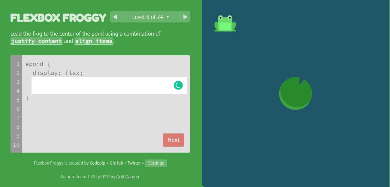
the right answer for this level is
#pond {
  display: flex;
  justify-content: center;
  align-items: center;
}
justify-content: center; will centralize the frog horizontally, align-items: center; will then centralize the frog vertically, in doing this, the frog will be well aligned to the center, where the lilypad is positioned. we can combine other values of align-items and justify-content to move content around the div container. you will encounter those kinds of exercises at other levels of the game.
flex-direction
By default, contents inside a div/container will stack up in columns(y-axis) but immediately you introduce display: flex; on that container, all the content stacks up in rows(x-axis). flex-direction allows you to manipulate the axis you want the content in a div/container to be in. the flex-direction property accepts four values
row: // Items are placed the same as the text direction.
row-reverse: // Items are placed opposite to the text direction.
column: // Items are placed top to bottom.
column-reverse: // Items are placed bottom to top.
flex-direction also changes the default behaviour of justify-content and align-items, with flex-direction: column; the justify-content now works in the vertical axis instead of horizontally, align-items will now be used to centralize content in the horizontal axis. keeping this in mind, lets consider the exercise in level 11.
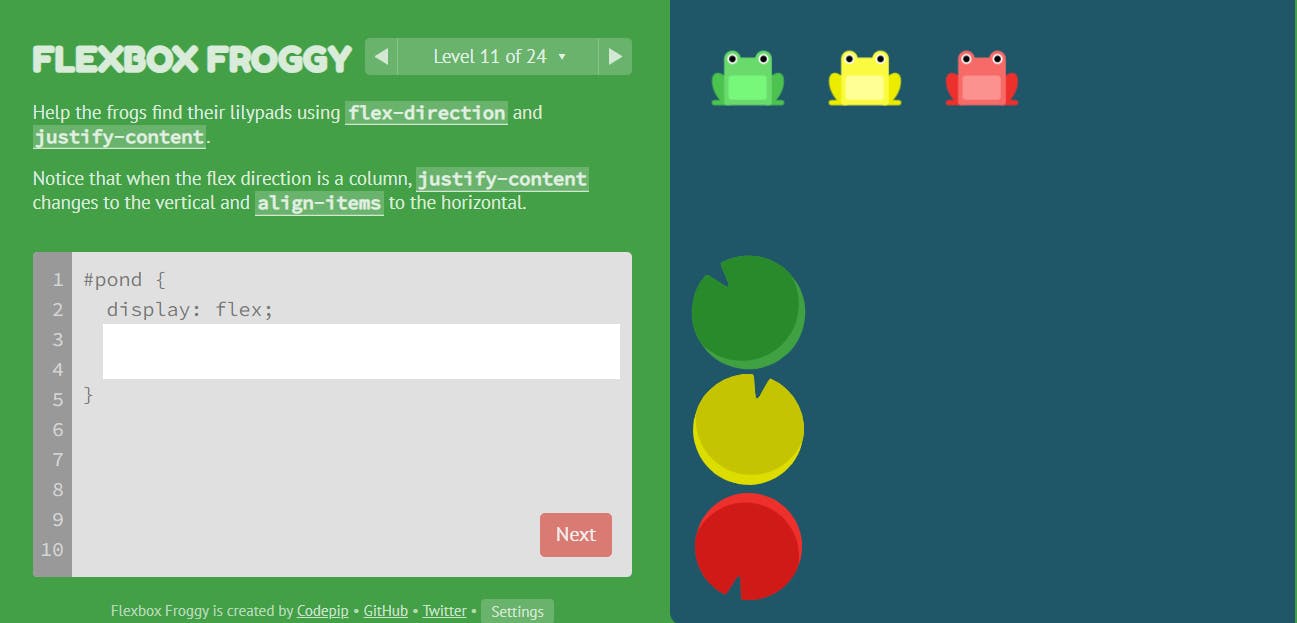 the answer will be
#pond {
  display: flex;
  flex-direction: column;
  justify-content: flex-end
}
flex-direction, justify-content and align-items
There are certain situations where you will need to combine these three Flexbox properties, flex-direction, justify-content and align-items. a proper knowledge of how they all work individually, will be a useful skill at that point. for example, let's consider level 13
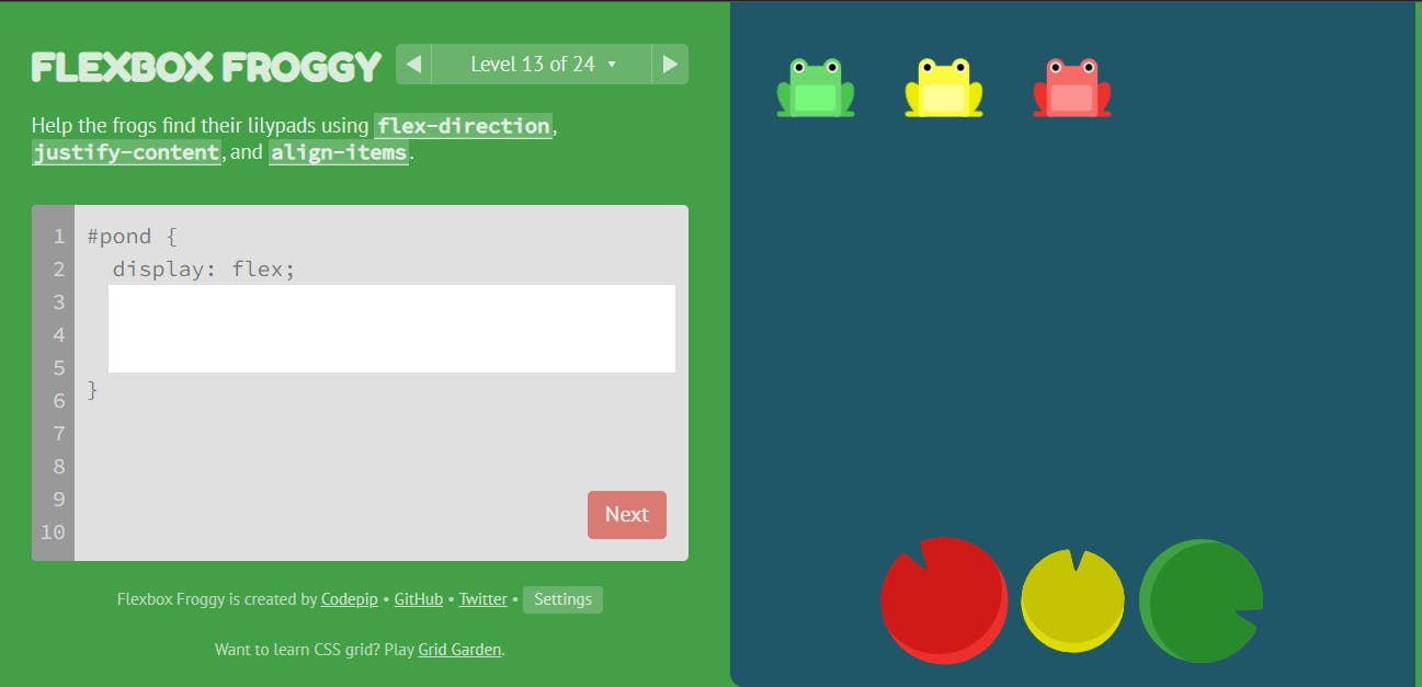 the answer to this level will be
#pond {
  display: flex;
  flex-direction: row-reverse;
  justify-content: center;
  align-items: flex-end
}
the first thing I needed to do was to reverse the way the frogs appear in the row with flex-direction: row-reverse;, then, I used justify-content to centralize it in the horizontal direction and finally, align-items: flex-end; to move the frogs to the bottom of the container.
In other not to make this article too verbose, I will be stopping here, if you want to master CSS flexbox skills I will recommend you go through all the levels in Froggy, you will get to master other CSS Flexbox properties like order, flex-wrap, flex-flow, align-self, align-content and how to combine them to achieve your desired results.
The game becomes more complex as you go, so if you don't understand any level, you can always drop a screenshot or mention the level in the comment section of this article. myself or someone else will help you explain that level, the code that will be used to solve it and why it is used.
Resources on flexbox
- CSS-Tricks (Blog)
- Flex-box CSS in 20 minutes (Youtube)
- Froggy (Flex-box Game)